
Tuesday, September 20, 2011
Urban Film School Shooting Shorts
The Urban Film School was on various locations during Art in Education week. Here is a sample of scene where the actress is at a vintage gas station prepping for a scene accompanied by the camera man and the director.

Middle School Vocabulary Performance


Math and Music Collaberations during Art in Education Week
The Music Performance classes under the watchful guise of Mr. Kyle Wilson had a wonderful week of Math collaborations during the Art in Education week. Mr. Mortis, Mr. Kelsey, and Mr. Wilson were able to tie their curriculum together to expose a multitude of students to the likes of sound wave and frequency measurements, and the always entertaining Oobleck, the mythical dancing fluid.


Elementary Arts in Education Recap
As the week of September 11- 17, drew to a close. Mrs. Guerra's elementary class had one last hurrah before the weekend. They worked on building 3-D models of cities they designed in the previous days. Not only did this instill a sense of pride but also teamwork. Way to go Mrs. Guerra!


Monday, September 19, 2011

SASIC at the NorthStar Educational EXPO
Join the San Antonio School for Inquiry and Creativity for a full day of Arts-Infused learning adventure at the South Texas School Expo sponsored by KSAT 12 on Saturday Oct, 2011 from 12:00 pm - 7 pm
Look for our booth on the ground level floor!

Look for our booth on the ground level floor!

Thursday, September 15, 2011
Stripes and Lines at Radius Gallery
Here is my second installment of Art reviews, in an attempt to expose my readership to the San Antonio Art Community. This series of art critics will occur at various times of the year, as I discover art exhibitions that have something unique and creative to say to the audience.


Process, Perspective and Perception
A painterly abstract interpretation of “architectural” design and “artistic” linear exploration
San Antonio, TX. - James Raska and Louis Vega Trevino are the dual artist tag team currently on exhibition at the Radius Center, located on San Antonio’s Auditorium Circle; an exhibit loosely curated by Joan Grona of the renowned Joan Grona Gallery-running through Oct. 1. Housed in a historic building in downtown San Antonio, the Radius is a multi-purpose space with functions ranging from art exhibitions, music, food, and performance; while housing several nonprofit headquarters.
Respected artists in their own right, Raska and Trevino team up to deliver a power house showing; a sucker-punch of artistic superiority. Exploring congruent linear qualities, hard edge abstraction, investigations in artistic insight, and creative subtleness; each artist holds true to a deliberate and aesthetic decision on a wide variety of process.
Consisting of 16 works of art, the exhibition favors Louis Vega Trevino with 10 painting, while James Raska attempts to clutch and sustain an artistic foothold with 6 new works ranging in style from early Minimalism to Conceptual. We see both artists breaking away from signature “styles”, and gaining new ground within a tranquil artistic progression; a personal development toward a refined look- experiencing growing pains along the way.
Along the right side of the multi-use space acting as the showcased wall, each artist has staked claim to the real-estate that best displays their efforts. With the curatorial directive of the exhibition starting with Trevino and his traditional stripe paintings, each visual cue is now grouped together to form geometric clusters. The viewer finds themselves shuffled along a hurried hue highway, resting at a middle ground of three Raska paintings that seem more explorative than graceful. Wrapped around a slight corner and extending to the next wall section, Trevino opens up a new world of painting orientations that catapult him to the high ground. Once known for his large scale stripe paintings, Trevino comes alive with a break from simple geometric alignments from the previous selections and invites the viewer into his world of artistic movement, optical illusion and irregular “Frank Stella-ish” shaped canvases –all making amusingly clever arrangements. Ending the exhibition, Raska lands some homage homeruns with his playful yet laborious minimalism.
Out-maneuvering the novice art appreciator, Raska sinisterly paints in a way that makes complexity look crude. Highly layered, sanded, and varnished art, Raska intuitively paints his creations while subconsciously submerged in the role of deceitful artiste. His moderate to non-existent color palette is only grossly erroneous once one deciphers his visual language spoken with a metaphorical painterly twang of sophistication.
Trevino’s showcase pieces include some of his more conservative combinations while making strides with his newly discovered flair for piece positioning. A more conventional but truly successful creation is the artwork titled listening-consisting of four distinct rectangular canvases all poised vertically. Always aware of his horizontal boarders, side to side pictography, and equally important color theory, Trevino positions these paintings in a very “inoffensive” and familiar alignment. Reading left to right, listening is a great introduction to his recent paint pairing displays; with his paintings acting as components in a larger installation-like environment. However, helmet is fine example of how to introduce one’s clientele to a new beginning. Harvesting his color compositional knowledge to the fullest, helmet embodies, in a very simplistic manner, the avenue in which Trevino is embarking.
Using two rhombus shaped canvases, he stacks one on the other- mimicking a plume or metal crown of a Roman warrior’s head gear. Choosing a distinct color limitation of yellows and greens, helmet’s linear qualities emanate a copper radiance; grounded by the earthy greens which are intermittently interrupted by seemingly reflective but buttery ochre. Arriving at vectors seems no small task for Trevino, but is a highly acclaimed prize on the artistic journey. Taking more freedom in pictorial placement, vectors is made up of four rhombus like shaped canvases arranged in a way that is not fluid nor geometric, but teeters on the brink of symbolic. With no one canvas sharing a common axis, each section is angled to a distinct degree; making for matching corners, but obsessively evident is the reference to negative space contemplations. Although the color range is minimal, again revisiting the blue/ green relationship, this only accentuates the distinct shape and designs on the wall-emphasizing the outside edges of the canvas, which create another layer of viewer appreciation.
Although Raska seems to force some the compositional elements within his paintings, some success stories can be written about his never-ending processes that haphazardly create elegant and atmospheric works of art. Line Composition #3 is a prime example of how he is also moving away from a pigeonholed caste. Using one point perspective, with the vanishing point systematically 12” to 18” off the right side of the pictorial plane, a lone horizon line will inevitably intersect two linear elements originating out of the lower left corner- angled upwards toward the top right.
However, upon closer examination, one begins to see repetition in shape, motif, and line; each having complimentary pairs in this particular work of art. Floating black round ball-like shapes are mimicked by ghostly black rings while a hard edge orange rectangle has a partner in the lower right corner-matched with a splintered and sanded woodchip; carefully tendered in order deflect a flaw and make it a purposeful laminate anomaly. The finely rendered horizon line is surrounded by a florescent pink aura, evidence of substrata color field layering. With an easily overlooked and subtle rounding of corners, Raska buffs out the curves with a light sanding, exposing the tree ring-like layers of paint; showing us the final layer is which we view the artwork is only a thin veil hiding the true essence of his work. Be careful not to miss the painted and sanded 1/4” edges of the wood panel, each left and right side having a purposeful contribution.
Line Composition #4 is a true Raska epiphany, here the deliberate decision to cut into the wood panel propels the two dimensional painting into the world of wall relief sculpture. Making two incisions, one on each side and extending into a third of the pictorial space, the cuts act as compositional elements; each paired with a yellow horizontal rectangle. These yellow rectangles are positioned in a way that visually, they respectively rest above and below the black negative aspect of the saw line; each one systematically painted so that the endpoint of the cut mark is even with the halfway measurement of the rectangle. Now comes the curveball, the cuts are flexed by a single screw driven into the back of the painting on the inside cut line, causing a panel protrusion; highlighted by the stark shadows casted down to show depth. A simple but elegant 1960’s reclaim; Raska contemporized a call back to an era of Lucio Fontana’s cut and slashed canvases.
Obsessively purposeful, each element in Raska’s paintings has a tenacity to be part of a greater whole; ranging from brush line marks to almost invisible color difference. You almost have to visually dissect the painting to arrive at an often overlooked minimalism meets conceptual appreciation.
Overall, both painters have shown San Antonio that they are ready to embark on a new artistic journey of lessons learned, challenges met, and new roads ahead; all the while continuing an already established visual legacy within the South Texas Art Community.


Wednesday, September 14, 2011
Arts In Education Week lessons in the classroom

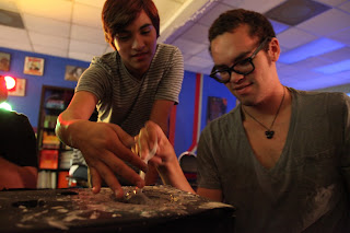
A student in Mr. Mortis's Math Class plays a Monochord as part of a music and math inclusion lesson. The teacher spent the weekend building the instrument as to teach a lesson on derivatives of 24"; and how each note/chord/pitch can be heard at intervals of 24, 12, 8, 4, etc.


Students in Mr. Frisch's 4th Grade Class use the laptop computers to research various Native American Tribes- their unique homes, weapons, agriculture and various cultural elements- then draw them and describe what they have learned in their cultural quest.
Monday, September 12, 2011


The Challenge: Teach kids about the benefits of eating healthy with fresh fruits and vegetables.
Entries must be postmarked by October 30, 2011.
Who Can Enter? Kindergarten through 6th grades as well as all home school and afterschool programs. Entries are limited to one per classroom, although multiple classrooms from the same school may enter the contest.
Prizes: Three (3) winning classrooms will receive the following:
• 1st Place: $1,000 Cash Reward for the classroom
• 2nd Place: $750 Cash Reward for the classroom
• 3rd Place: $500 Cash Reward for the classroom
• 2nd Place: $750 Cash Reward for the classroom
• 3rd Place: $500 Cash Reward for the classroom
Take the Challenge!
See Official Rules for full details.If you have any questions about the contest, please contact Amber Bloom at amber@produceforkids.org.
Arts In Education Week

A National Spotlight for Arts Education
In July of 2010 the U.S. House of Representatives passed a resolution designating the second week of September as “Arts in Education Week.” The resolution (H.Con.Res. 275) was proposed and introduced by Rep. Jackie Speier from California.
The resolution states: [...] Arts education, comprising a rich array of disciplines including dance, music, theatre, media arts, literature, design, and visual arts, is a core academic subject and an essential element of a complete and balanced education for all students.
Click here to view the HR275 Arts in Education Week Resolution
Congress designated Arts in Education Week to promote and showcase the immense role arts education has in producing engaged, successful, and college and career-ready students. You can read statements made by congressmen on the House floor regarding arts education HERE.
In May of 2011 arts education was again given a national spotlight with the release of the President's Committee on the Arts and the Humanities report Reinvesting in Arts Education: Winning America's Future Through Creative Schools.
The culmination of 18 months of research, meetings with stakeholders, and site visits all over the country, this report represents an in-depth review of the current condition of arts education, including an update of the current research base about arts education outcomes, and an analysis of the challenges and opportunities in the field that have emerged over the past decade. It also includes a set of recommendations to federal, state and local policymakers.
The culmination of 18 months of research, meetings with stakeholders, and site visits all over the country, this report represents an in-depth review of the current condition of arts education, including an update of the current research base about arts education outcomes, and an analysis of the challenges and opportunities in the field that have emerged over the past decade. It also includes a set of recommendations to federal, state and local policymakers.
Wednesday, September 7, 2011
Urban Film School at Brackenridge Park 9-6-11
-San Antonio, TX.
Students enrolled in the Urban Film School at the San Antonio School for Inquiry and Creativity began to explore their love for film with their first hands-on video and acting activity at Brackenridge Park on Sept. 6, 2011. Students toiled over several shorts that were written by the fellow students. Ranging from the ephemeral display of a variety of emotions (instructed to not use language or words) to a mocumentary comedy about a man in love with a taxidermy animal head, students were able to put their ideas to the test and get out of the classroom for the first time this school semester amidst the “cooler” weather. Filming will last 3 days as the students gain a new familiarity with the HD camera equipment and bond with the two instructors- Emmy Nominated Director, George Ozuna and Technology Director, Allysun de Leon.


Friday, September 2, 2011
HIther and Thither, an Art Exhibition at Joan Grona Gallery
In an attempt to help expose the students and their families to the greater artistic community, I will begin posting Art Reviews by one of our faculty members, Gabriel Diego Delgado, who has written for various art and news publications.
This article is one of his current articles which went to print on 9-2-11 and is commenting on the most current art exhibition at Joan Grona Gallery in Blue Star Arts Complex.
-------------------------------------------------------------------------------------------------------------


This article is one of his current articles which went to print on 9-2-11 and is commenting on the most current art exhibition at Joan Grona Gallery in Blue Star Arts Complex.
-------------------------------------------------------------------------------------------------------------
Hither and Thither
A Curatorial Juxtaposition of Environment vs. Aesthetics
Artwork of Darrell Roberts and Candace Briceño
By Gabriel Diego Delgado
-San Antonio, TX. Hither and Thither, a two person exhibition at Joan Grona Contemporary Art Gallery that opens Sept. 1, 2011 and runs through October is the brain-child of Guest Curator and San Antonio talent, Ana Fernandez. Her first guest curatorial endeavor, Fernandez eloquently weaves a web of playful pictorial deceit with a color and theoretical apposition of environment acting as leading contextual elements in a comprehensively critical and analytical exhibition. Working on several conceptual levels, Hither and Thither takes the viewer through an overwhelmingly quantitative world of heavily textured paintings divvied with incongruously drawn and dreamy, Neverland-channeling artworks.
Darrel Roberts, inspired by the ever present construction-site landscape of the “Urban” spread of Chicago, creates works of art that successfully attempt to capture that unrelenting buzz and hum of the inner city Chicago heartbeat. On the other hand, Magic Hat #9, a drawing series is a composite of 24 works on paper that metaphorically mimics the late evening and nocturnal sensibility of rural Vermont. Fernandez couples this visual display of pure painterly emotion with a new and fresh, but border-line poignantly playful and garishly distorted Wonderland-esque landscapes by Austinite Candace Briceño.
Taking all aspects of view-ability into account, Fernandez captures a kind of curatorial cornucopia, doing justice to these two unique artists by finely walking the ultimate and questionably ethical art based curatorial role of when does the “organizer” stop being a Curator and cross that hampered line to Installation Artist. Fernandez’s ability to analyze audience demeanor plays a concrete role in her aesthetic decisions of how and why to hang the overall exhibition. Working with 50 plus paintings by Darrell Roberts, Fernandez’s decision to anticipate a right to left viewing enabled her to think conceptually and intuitively when hand-picking the individual paintings. Then expressively designing an exhibition wall composition reminiscent of what she visualizes as a whimsical explosion of a dandelions blowing in the wind; a concentrated curatorial effort to display an asymmetrical but fairly random alignment. This is all achieved by building up the arrangement of canvases to a larger cluster of overpowering and multi-layered cityscapes, popping in very small and randomly placed paintings. These miniscule artworks are subtly different than their immediate company, in that at their core they exist only to capture a few moments in time when the artist’s eye rests for a minimal amount of time on arbitrary peripheral elements like building facades, water reflections, horizons and other miscellaneous banality.
Roberts makes sure we are all well aware of his coveted artistic lineage to the historical forefathers of Abstract Expressionism-with his deliberate color soirees; emotionally driven abstract paintings that take on aspects of sculpture, but hold true to a two dimensional security. Roberts comments on his ability to “condense the Macho Man” of the Abstract Expressionist era and micro-size the scale, but maintain the signature expressive attributes of overall composition and gestural flare.
Featured on the right wall of the gallery, Candace Briceño’s art has trouble holding ground to such adjacent color explosions. However, her minimally hued agave sculptures convey an organic responsiveness to the exhibition; that up until now was an absent artistic contribution. Her simplistically brilliant and ephemeral sense of nature is only reinforced by her material choice. Felt, a fabric lending itself to a distinct look and feel is the perfect selection for sculpture- albeit an entirely opposite characteristic of the real deckled leaf features of this native plant. White, with one color accents, these carefully constructed Oldenberg-ish sculptures are a breath of relief and a much needed visual break in this color saturated environment.
On pedestals placed through-out the gallery sit Briceño’s mushroom sculptures; eloquently contrasting the garish and gritty paintings of Roberts. Potentially threatened by his overpowering and parasitically pigmented painterly pieces, Briceño’s clean linear seams and meticulous constructive qualities of the fungi prove to be key components that highlight the artist’s intention on overall presentation. Evident is her intuitive understanding of artistic gestalt; fluid are her aesthetic decisions concerning such cartoony and suggestive low-brow subject matter.
Solidifying this first curatorial effort is Ana Fernandez’s choice to create a visual juxtaposition on the immediate left wall of the gallery space. A wall never used to capacity previously, Fernandez is able to maximize spatial limitations while creating an environment that changes the meaning of both artists work into a curatorial derived environment. Roberts’ drawings from the Magic Hat #9 series make up a pictorial grid- now construed into a visual assimilation of an all too familiar skyscraper facade. Systematically placed in front of this wall is the larger of two agave plant sculptures, titled Agave #1. Now more decorative landscaping and curb appeal aesthetic than artist owned imagery, this Austin based sculptor’s intent is assimilated into an overall visual cue- organized by one curator’s vision.
In the end, a one local’s curatorial revelation plays a solid hand against two poker faced artists, each grappling with a hidden sense of communal acceptance and environmental analysis; eluding to a distorted but inviting artistic paradise.

detail of Behind the Dark, 12" x 12", oil and pumice on canvas

Installation view of Agave Number 1 with Magic Hat Number 9 drawing series
Thursday, September 1, 2011
Texas Workforce Commission Tax Office In-kind donation
The San Antonio School for Inquiry and Creativity partners with the Texas Workforce Commission’s Tax Office for their technology focused giving program -receiving an administrative based in-kind charitable donation.
Each year the governmental agencies and city tax dependent entities are mandated by the state to donated surplus technological equipment to nonprofit entities. This year the Texas Workforce Commission picked educational entities as their focus, using www.greatschools.org as their source for potential partners.
The San Antonio School for Inquiry and Creativity was selected and invited to participate in this year’s giving. On behalf of the Texas Workforce Commission’s Tax Office, the San Antonio School for Inquiry and Creativity accepted an in-kind donation of two industrial grade Lexmark office printers. Each capable of supporting a medium size administrative team; the printers are geared toward a proactive approach to individualized clerical administrative printing needs. Supplying the school with four brand new ink toners and two boxes of Lexmark staples, the Texas Workforce Commission has picked a great nonprofit entity in this gesture of educational appreciation.


Subscribe to:
Comments (Atom)